Gallery
Reading Lamp A Warm Dim Landing
Palette
Primary
Accent
Background
Card
Foreground

Reading Lamp

A warm dim, not a black

Almost every dark mode goes to near-black and puts white text on it. For a great many readers that produces halation — the letters bloom and smear — and the usual fix is to lower the text, which lowers the contrast, which is worse.

This one raises the ground instead. The dark mode here sits at a warm dim, roughly the colour of a page under a lamp, and the contrast is unchanged. It looks unfashionable in a screenshot and it is markedly easier to read for an hour.
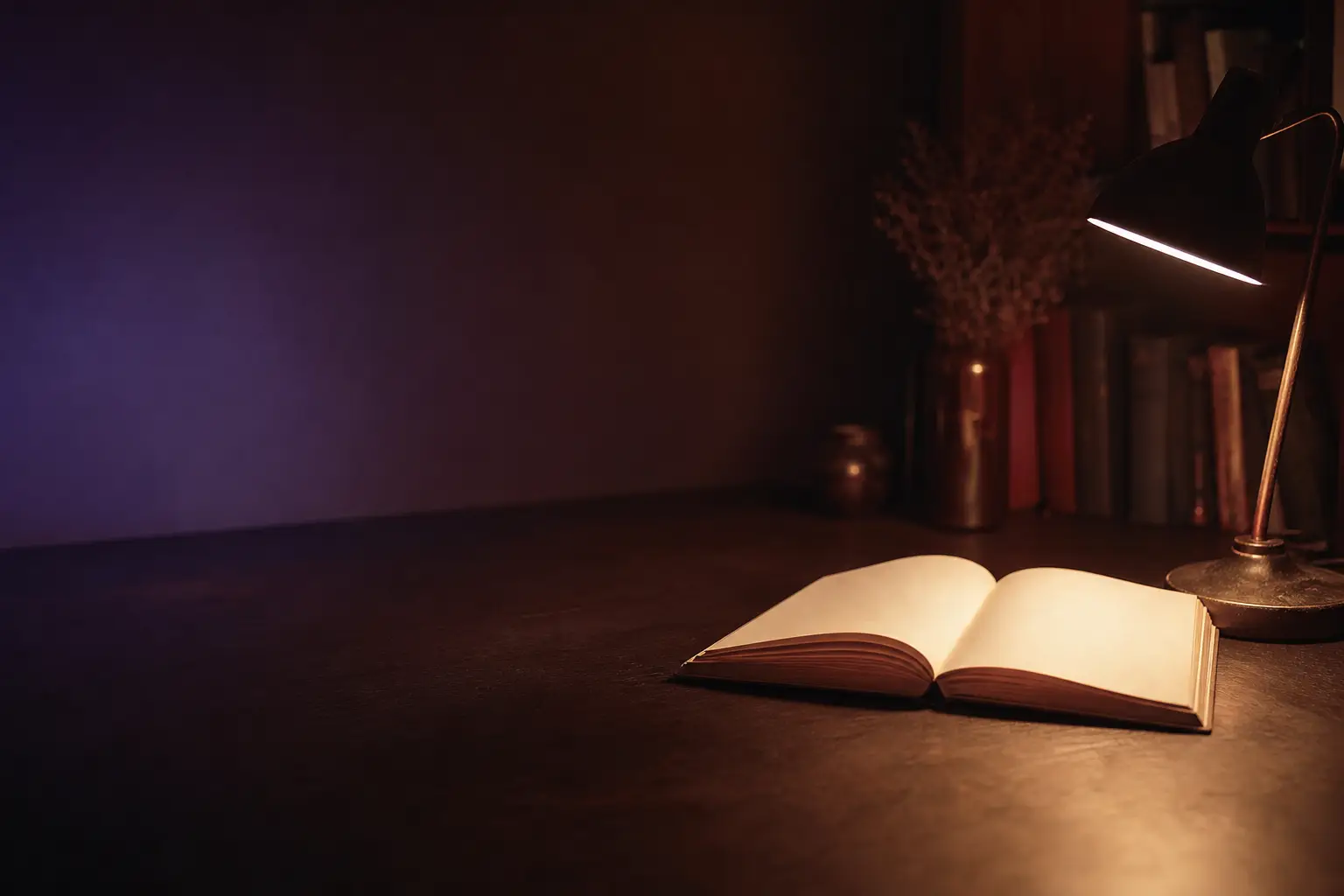
A pool of warm lamplight falling across an open book on a desk
An actual lamp, on an actual desk. The dark mode is trying to be this.

The measure is locked at 66 characters and there is no full-width mode. This is the one thing people complain about and we are not going to change it: a width control is a way for a reader to make their own experience worse, and on a 32-inch monitor they will take it.

There are two controls in the entire application. Size, shown as five rules of increasing length, and warmth, which moves the ground and the text together. No font picker, no theme picker, no justification toggle, no line-height slider. Those are all decisions, and we have made them.

Links in the text are the same colour as the text with a rule under them. Footnotes expand in place and push the paragraph down, because a footnote in a popover covers the sentence it belongs to.